Dashboard
The dashboard facilitates monitoring predictively-scaled events and scaling pods for a given application. It provides various metrics to track the progress of scaling for both preconfigured events and running applications.
After you install the agent, signing into Smart Scaler Management Console lands you on the Dashboard page.
On the Dashboard page, you see the Overview, Details, Billing, and Savings Report tabs.
Dashboard Overview
The Overview tab shows aggregate values to see how your applications are performing at glance.
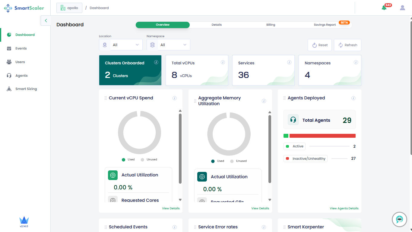
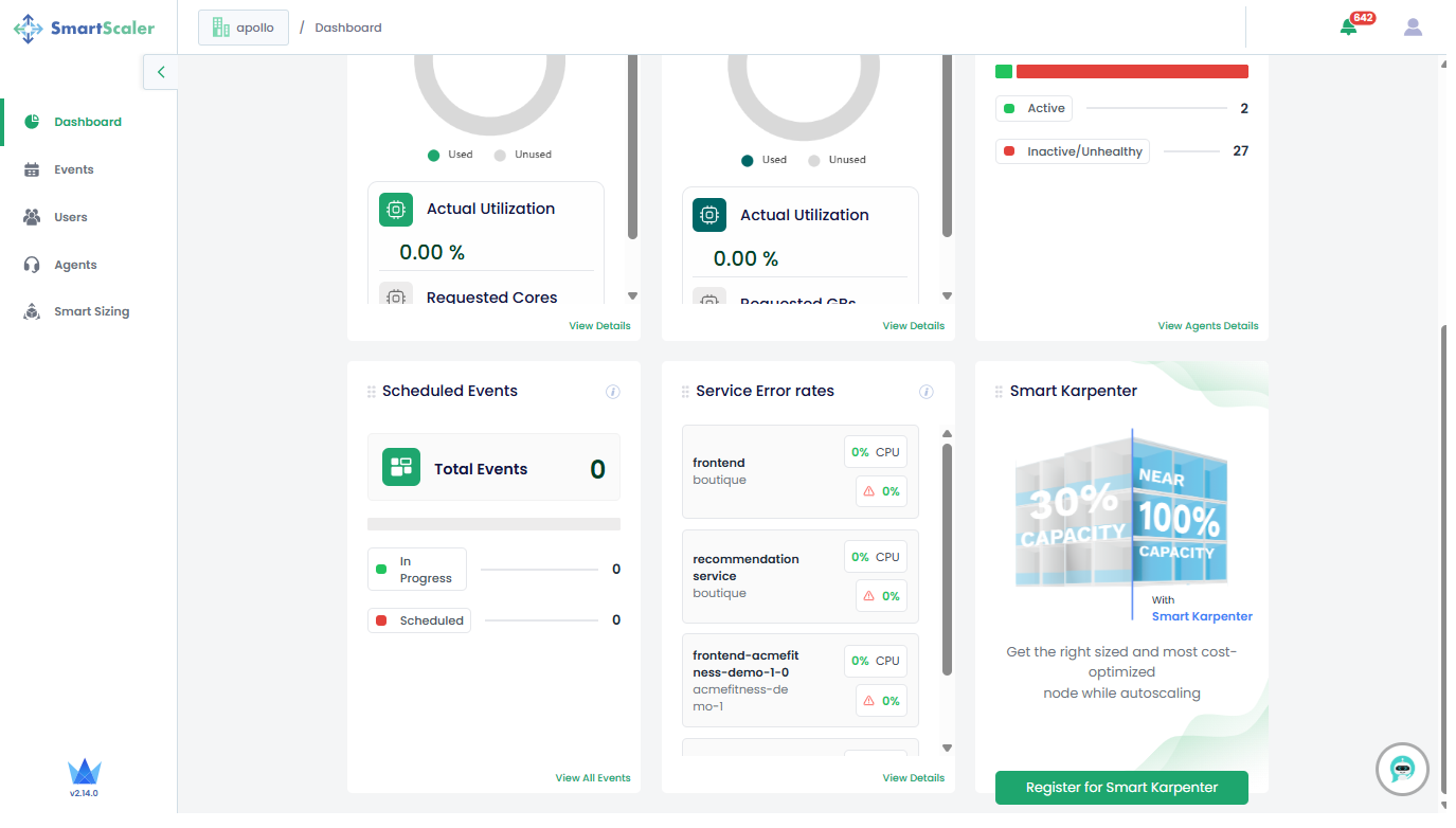
Scroll down to see the list of tiles that are towards the bottom of the page
The following are the description of tiles that appear on the dashboard page:
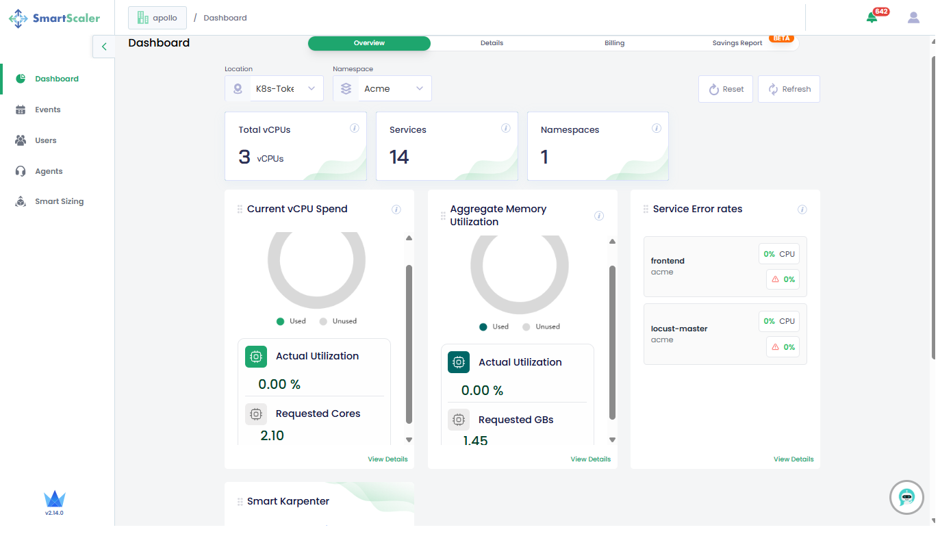
- Clusters Onboarded: The total number of clusters onboarded to the Smart Scaler for the tenant.
- Total vCPU: The estimated aggregation of total CPU consumption in cores.
- Service: The total number of Kubernetes deployments onboarded to the Smart Scaler for the tenant.
- Namespaces: The total number of Kubernetes namespaces with deployments being managed by the Smart Scaler for the tenant.
- Aggregate CPU Utilization: The (current CPU utilization or the current total CPU request) * 100 for all deployments managed by the Smart Scaler for the tenant.
- Aggregate Memory Utilization: The (current memory utilization or the current total memory request) * 100 for all deployments managed by the Smart Scaler for the tenant.
- Agents Deployed: The total number of active agents and inactive/unhealthy agents.
- Scheduled Events: The total number of calendar-based events.
- Service Error Rates: The percentage of errors in each microservices.
- Smart Karpenter: Get the right sized and most cost-optimized node while autoscaling by registering for Smart Karpenter.
Narrow Down the DashBoard Overview
On the Overview tab of the Dashboard, the Location and Namespace drop-down lists
help narrow down the monitoring scope.
The following figure shows the overview after selecting a cluster location and a namespace.
Dashboard Details
The Details tab displays metrics for each microservice in your application.
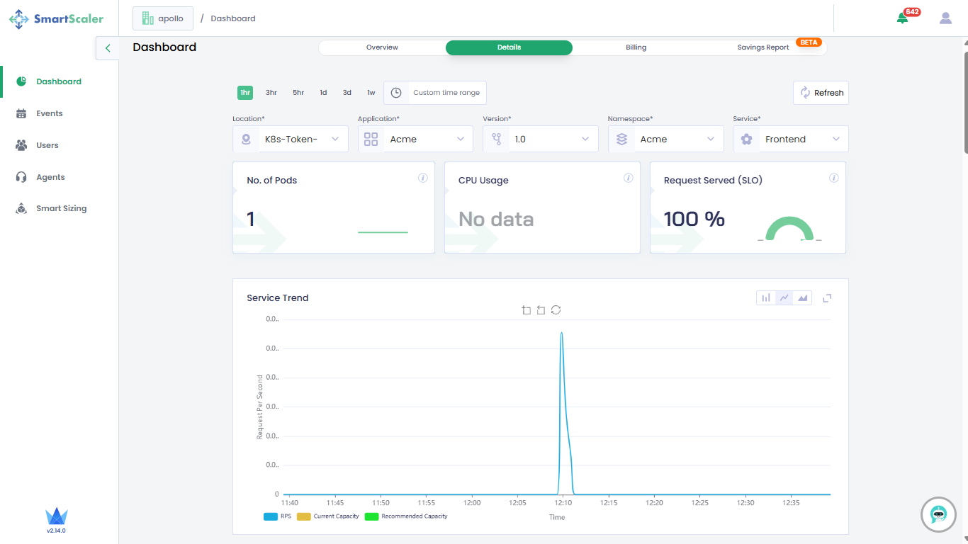
To view application metrics:
- On the top of the Dashboard page, use the drop-down filters to select the application, version, cluster, namespace, and microservice.
- Below the drop-down lists, find information on the number of pods, CPU usage, and request served (in percentage) for the selected microservice of an application.
- Metrics are individually tracked and presented in a graphical format.
- Adjust the time range (default: past hour) as needed.
Monitor the Service Trend and Error Rate
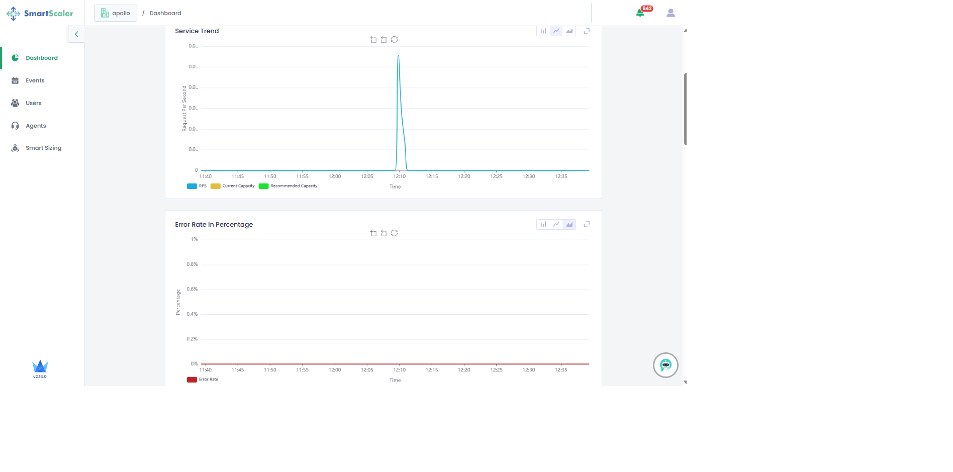
The Service Trend provides the pod capacity and requests per second. The Error Rate represents the requests that have failed.
Monitor the Request Per Second and Pod Count
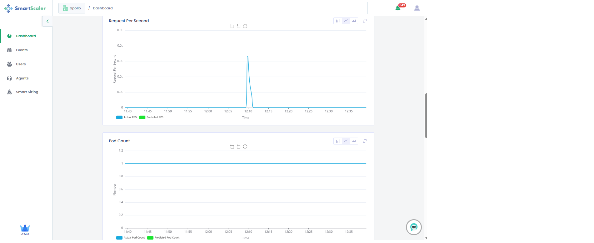
The Requests per Second (RPS) graph represents the actual RPS and the predicted RPS versus time. The two separate line graphs represent the predicted RPS and actual RPS at a given point in time.
The Pod Count graph represents two separate line graphs one each for the actual pod count and predicted pod count at a given point in time.
Based on the incoming Total Traffic, Smart Scaler calculates a Predicted RPS value.
Using this value, it recommends a pod count to meet that demand in
Pod Count Predicted. Finally, the actual number of pods running for this service is
visible in Pods Count Actual.
Monitor the CPU and Memory Usage
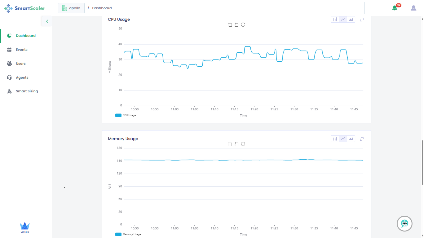
The CPU and memory usage are displayed for each microservice. Based on the Predicted RPS value, the Smart Scaler calculates the number of pods required for the application.
Monitor the Smart Sizing Details
Scroll down to the bottom of the dashboard to see the Smart Sizing Details.
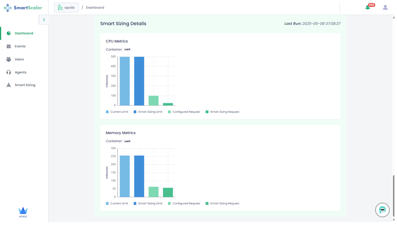
Under Smart Sizing Details:
- See the number of pods in the selected microservice of your application.
- See the CPU Metrics to track the difference between the configured limits/requests and recommended limits/requests.
- See the Memory Metrics to track the difference between the configured limits/requests and recommended limits/requests.
The orange circle next to the metrics indicates that the microservice's pod and container resources can be optimized and require your immediate attention.
Monitor the Billing Information
On the Dashboard page, go to the Billing tab to monitor the billing. Select the month and year that are in the past.
An admin can only view the billing details. Non-admin users get access forbidden message on this tab.
The provided year and month must be in the past. Current or future month and year are not allowed.
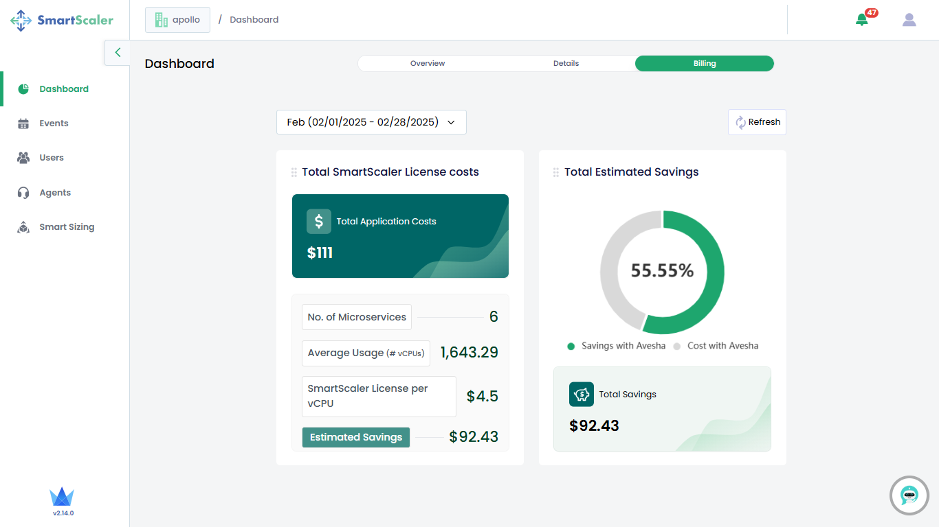
The following billing information is provided:
- Total Smart Scaler License costs: This tile provides the total application costs, number of microservices, average usage (in vCPUs), and Smart Scaler License per vCPU. It also provides the estimated savings with Smart Scaler.
- Total Estimated Savings: This tile provides the savings and the total cost with Avesha represented in a pie chart.
Monitor Savings
To monitor savings made by using Smart Scaler:
-
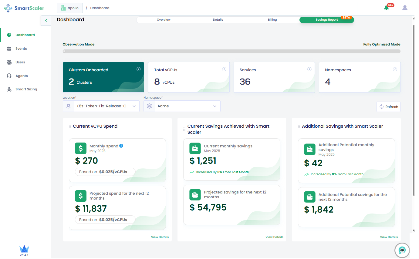
On the Dashboard page, go to Savings Report.
-
On Savings Report, you can narrow down the report using cluster Location and Namespace drop-down lists.
-
These are the different kinds of reports that you can monitor:
- Current vCPU Spend: This report provides a breakdown of the current monthly expense and the projected expense for the next 12 months. All values are based on US dollar per vCPU.
- Current Savings Achieved with Smart Scaler: This report provides a breakdown of the current monthly savings and the projected savings for the next 12 months.
- Additional Savings with Smart Scaler: This report provides a breakdown of
potential additional monthly savings for the current month and the next 12 months.
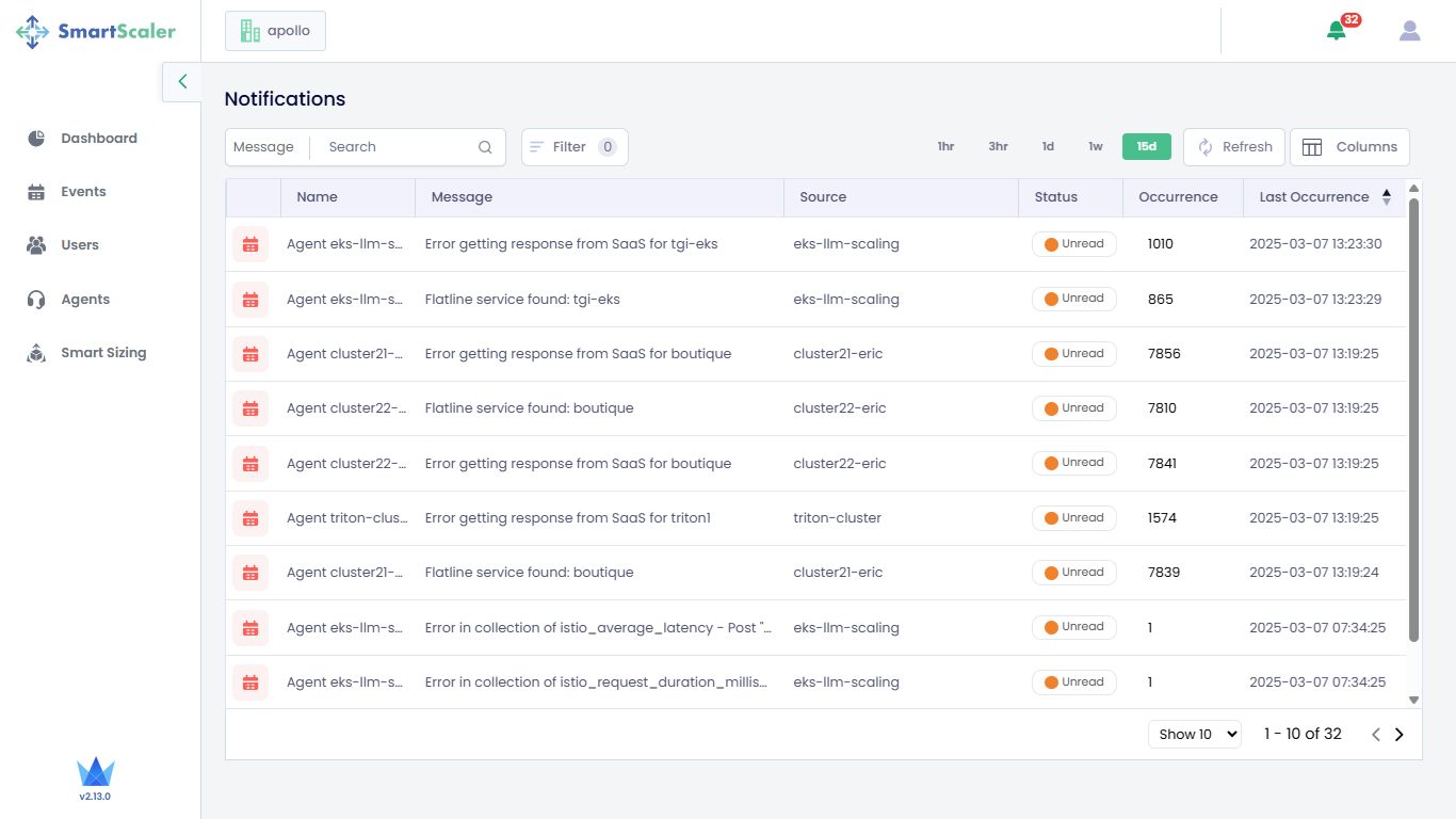
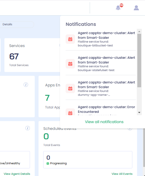
Notifications
Smart Scaler generates notifications for a deployed agents and system events. All of these generated events are specific to SmartScaler operations.
The notifications are listed on a page that is accessible by clicking the bell icon on the top-right corner of all the SaaS management console tabs.
To see the event notifications:
-
Go to any other tab on the left sidebar.
-
On the dashboard (or any other feature) page, click the bell icon that is on the top-right corner of the page.
-
Click View All Notifications to view all the notifications on the Notifications page.